This is a full review of ScholarLMS, a cloud-based learning platform based on Moodle and bundled with Gamification, eCommerce, xAPI support and some other interesting features that we will look at.
Here’s a quick overview of the platform by the vendor:
And here’s what I’ll cover in this review:
- Features
- Detailed overview
a) Learning the ropes, ease of use
b) Managing users and user roles
c) Creating and adding content, and assigning it to users
d) Reporting
e) Branding, integrations, and security
f) Learning experience and mobile device support - Pros and Cons
- Pricing
- Business tasks that it handles
ScholarLMS Features
I sorted all present and missing features in ScholarLMS into five categories: Administration, Content, User management, User experience, and Customization in this spreadsheet:
| ✔ | ✘ |
|---|---|
| Administration – ease of getting started with and administering the platform. | |
| Event log | No onboarding |
| Strong security features | No custom reports out of the box |
| All email notifications can be edited | No scheduled reports |
| E-commerce with over 12 integrations with payment processing services like PayPal | The knowledge base often didn’t have what I was looking for |
| Google Analytics tracking can be enabled | |
| Content – authoring capabilities, supported formats and possibilities of combining separate modules into learning paths. | |
| Supports DOC, PPT, XLS, MP4, MOV, SCORM 1.2, xAPI, IMS, JPEG, GIF, MP3, WAV, and online video (YouTube, Vimeo) | Learners have to download PPT files to view them |
| Has a built-in quiz editor with 15 questions types | No built-in authoring tool |
| Multiple files can be uploaded at the same time | Disk space for content is limited even in highest pricing tiers (200GB) |
| No maximum size for Video and SCORM uploads (real limitations have to be tested) | |
| ILTs can be added to course structure | |
| User management – adding and managing users, creating and assigning roles. | |
| Bulk user import via CSV | No automatic rules to make new users automatically end up in specific groups based on their profile |
| Self-registration | |
| All existing user roles can be customized | |
| New user roles can be created | |
| User experience and Social learning – using the platform to study on a desktop or mobile, notifications for due activities, discussion forums. | |
| Signing in via Gmail, Facebook or Microsoft | No branded mobile app (the Moodle app can be used instead) |
| Custom completion certificates | |
| Learner interface can be in almost any language, since Moodle is available in so many languages | |
| Discussion boards (forums) and live chats as social learning tools | |
| Gamification | |
| Customization and Integrations – changing the design and integrating the platform with third-party applications. | |
| Custom CSS, HTML and JS can be added to pages | No API |
| Lots of features for customizing the platform’s look and feel | No integrations with CRM or HR systems out of the box |
| OAuth 2 and SAML for SSO | |
| Zoom and BigBlueButton integrations for live training | |
ScholarLMS Detailed Overview
Let’s take a closer look at the platform by checking out what it offers in terms of user experience. We’ll start at the very beginning and evaluate how ScholarLMS handles onboarding.
Learning the ropes, ease of use
ScholarLMS initially greets you with a screen where you set up your learning portal branding and add first users:
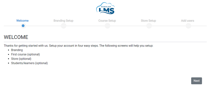
Of the LMSs that I’ve been reviewing lately, too many of them shy away from explaining how you can get going in the shortest time possible, so I appreciate the effort made by Scholar to make things simpler.
However, as I was advancing through this first-time setup, things slowly started to go off the rails. Here’s what I saw on the “Create your first course” screen:
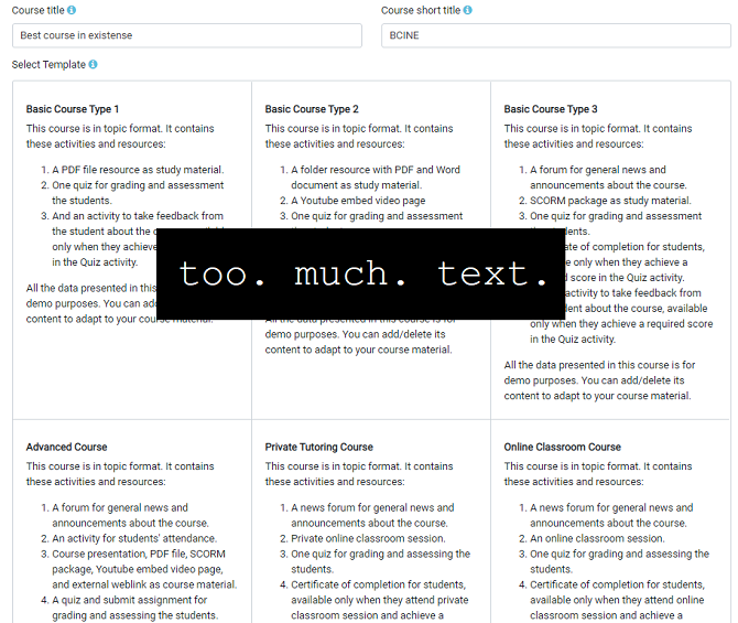
As you can imagine, I didn’t have the patience to read through it all, so I simply selected a random option.
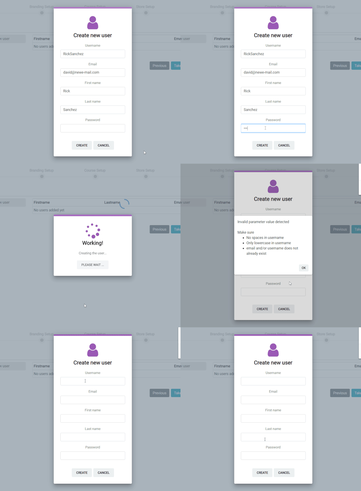
Adding a learner proved to be another test of patience. Here’s what happened: I entered the info without the platform telling me that some fields might be filled out incorrectly. When I clicked on Create, Scholar simply cleared out all the fields, making me start from scratch just because of two capital letters in the username.
After completing the first-time setup, I finally got to see Scholar’s Dashboard. It’s a very standard WordPress-like UI that feels quite modern:
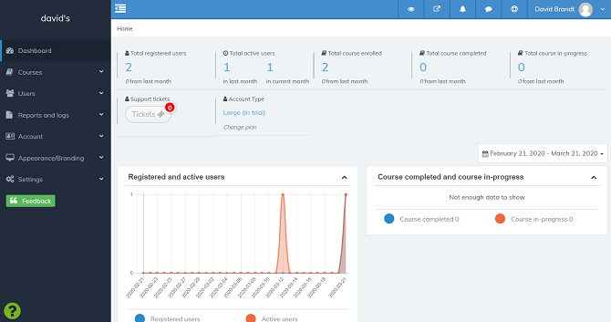
What I didn’t like about it was that there are no pop-up hints for the top row of icons without labels. And there’s no onboarding tour either, so you have to figure out what each of these icons does by trial and error.
I went to Scholar’s knowledge base and found a quick start guide, but it turns out that it lacks a cohesive narrative and provides inadequate screenshots. To top it all off, there’s a “Help” button on the dashboard button that does absolutely nothing:

Concluding this portion of my review, I’ll say that I can recommend ScholarLMS for neither its ease of use nor its onboarding – which is nowhere to be found, by the way.
Managing users and user roles
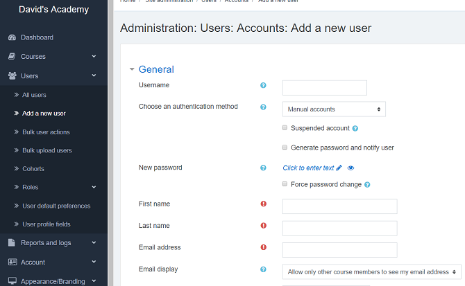
Every ScholarLMS trial account comes with a few dummy users that can be used for testing. It comes as no surprise that new users can be added via UI and in bulk via CSV upload: Self-registration is an option as well.

Here I started to notice that the platform’s interface looks a bit more familiar to me than being just another LMS that resembles WordPress. I checked the official website and found that Scholar is based on Moodle.
Users in Scholar are organized into Cohorts and Groups. Cohorts are created manually, whereas Groups are built and managed inside courses. The way it works is that you create a cohort of users and enroll it in a course. But this cohort might include learners that speak two different languages. So, you split the enrollment for this course into two groups and assign these groups to two different instructors. This is one of the concepts that Scholar inherits from Moodle and I think it’s more suitable for academic use than for business.
There are five main user roles: Admin, Manager, Course Creator, Teacher, and Student. You’re given the ability to create custom roles, which I wasn’t able to test because despite my registering for the top-tier pricing plan trial, the custom role menu was locked:
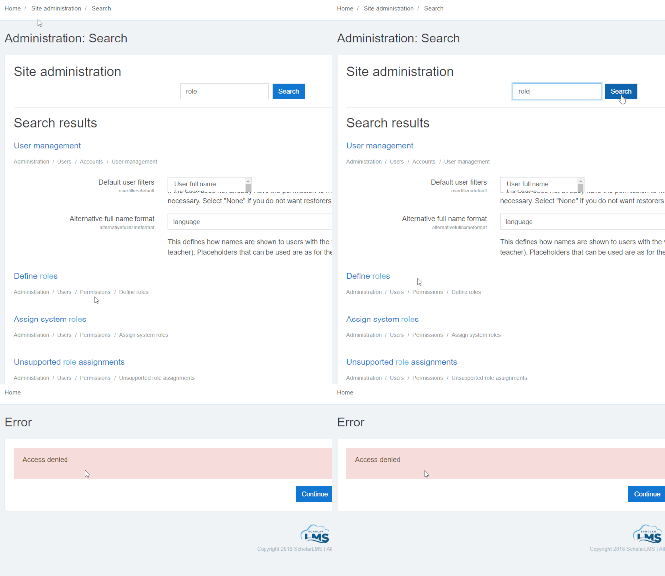
User management in Scholar would definitely be more suitable for academic institutions with faculties and classes than companies with branches and departments.
Adding and managing content
To start creating content, you first need to build a new course. Once it’s there, you can add files to the chapters of your course. The platform supports the same file formats as Moodle (the ubiquitous PDFs and PPTs), plus a couple of other things like xAPI. You can add Zoom or BigBlueButton webinars to your course structure as well:
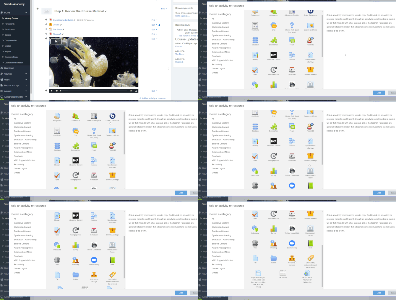
If you need to build a quiz, a survey, or just a small poll to ask your learners something, Scholar is not problematic. The quiz editor is a little bit cumbersome, but it shouldn’t be difficult to handle with some practice. It has around 15 types of questions, which is shocking. Seriously, it’s the first LMS to have so many question types in the built-in quiz editor. Also, it boasts an integration with H5P, a web-based content creation tool.
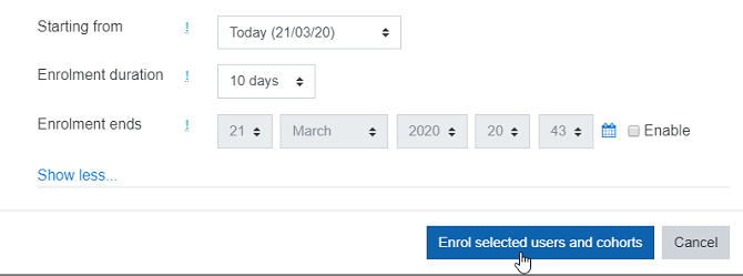
After your course is ready, you’re able to enroll learners. This can be done for each user individually or by selecting a cohort of users. There are due dates and it’s possible to schedule enrollment to start either immediately or at some point in the future:
Unfortunately, courses can’t be combined into Learning Paths, as they can with most of today’s LMSs. Or, perhaps this can be done with one of the blocks that can be added to the platform using the corresponding menu:
At any rate, the content management in ScholarLMS is solid, just as it is in Moodle. It’s just that some of the options might not always be where you would expect them to be.
Reporting
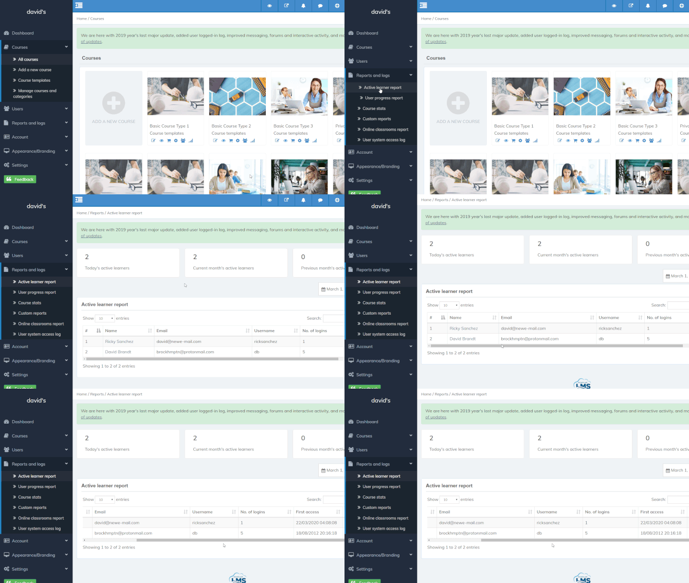
There are only three reports available by default: Active Learner, User Progress, and Online Classroom. Here’s the Active Learner option:
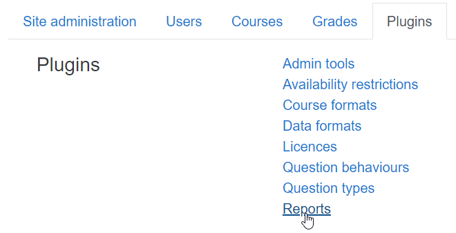
The documentation states that it should be possible to install other report types as plug-ins, but, unfortunately, the menu didn’t want to open, which is most probably another limitation of the trial version.
Scholar also has a custom report option, but that one doesn’t let you create any custom reports yourself but necessitates requesting it from the dev team. You need to send a description of what kind of report you’re looking for or attach a mockup of the desired report to your request:

It is worth noting, however, that Scholar gives you access to quite a few internal reports, like Change History, Performance Overview, and Security Overview. As someone who has tried out dozens and dozens of different LMSs over the past few years, I can say that having access to these internal reports is rare and useful.
Branding, integrations, and security
In the learning community, Moodle is famous for its customization capabilities and ScholarLMS inherits this quality from its predecessor. There are endless possibilities for changing the look and feel of your platform for both admins and learners: changing themes, editing colors, fonts and widgets, adding custom HTML to pages, even creating your own onboarding tours for new learners:
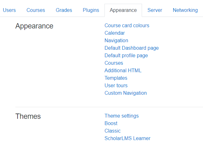
But, there’s a downside – the advanced settings menu where all these options reside is kind of monstrous. It can really be a tough nut to crack for those who have never used Moodle before.
The list of integrations available for the product is actually pretty short: H5P, Zoom, BigBlueButton, and Microsoft Office 365. There are also a few Single Sign-On options with OAuth 2 – Google, Facebook, and Microsoft. But that’s about it. Whether it’s possible to integrate ScholarLMS with any CRM or HR platform is not evident, as the help docs say that you should contact the dev team for that. I suppose that such integrations are developed for each client individually.
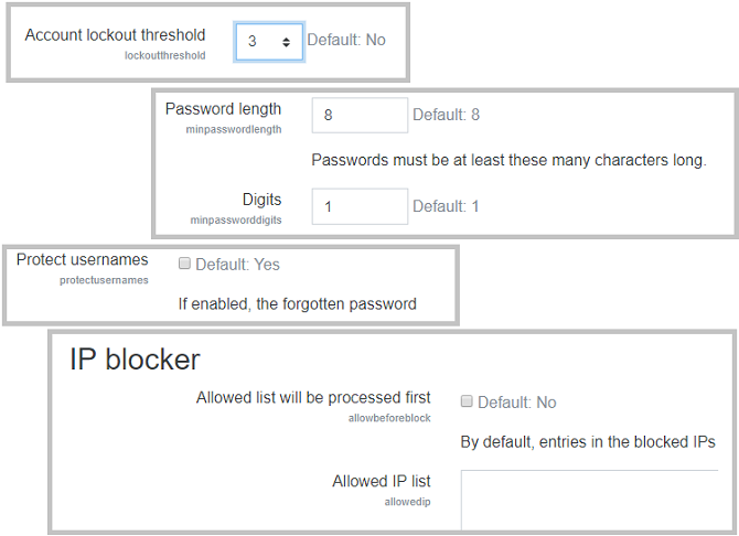
In terms of security, Scholar blows other LMSs out of the water with its event logging, lockout on failed attempts, IP filtering, and many other options that are just not available on other platforms:
To conclude this section, I just want to point out that most of the features that Scholar boasts in this category were first introduced in Moodle.
The learning experience and mobile device support
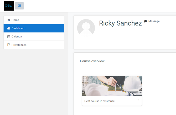
The desktop user interface is simple – you land on a customizable Dashboard and find Direct Messages and Notifications on the top, and a calendar for ILT events on the side:
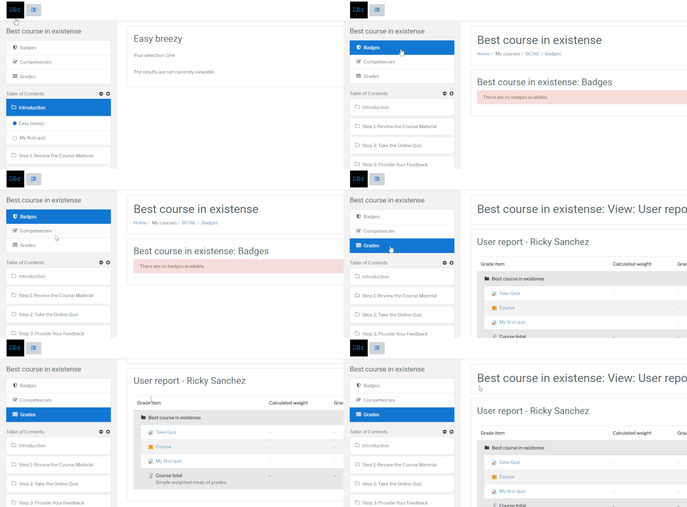
If you open a course, you’ll see three additional menus on the left: Badges, Competencies, and Grades. These will show your achievements for the course selected:
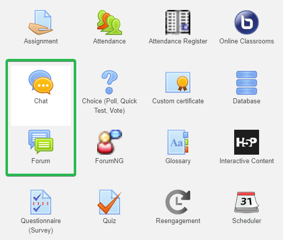
There are two types of social learning activities in which learners can participate. The first is a chat where learners can communicate in real time. The other is Forum – a simple message board where learners assigned to the course can share their questions with each other:
Unfortunately, it doesn’t have its own mobile app. But if you enable the corresponding option in the settings, you learners will be able to use the official Moodle app. It has the same dashboard, calendar and messaging components as the desktop version. It can even play SCORM modules. But that’s the Moodle app, so I won’t go deeper into that here.
To summarize my impressions from being a learner on this platform – it’s fine. There’s gamification in the form of badges, there are social activities like forums and live chats, and custom certificates of completion can be awarded for courses. The design is okay out of the box, but if you take the time to customize it, you can make it much more attractive.
ScholarLMS Pros & Cons
Pros
- Has a free plan for 25 active learners per month and 2GB disk space
- Lots of design customization features
- Great security functionality
- A number of online reviews state that Scholar’s tech support is great
Cons
- No onboarding
- Interface is hard to navigate if you have never worked with Moodle before
- Requires lots of tweaking
- Many useful features are only available with the higher-priced plans
- Lack of canned reports, additional reports must be installed as plug-ins
ScholarLMS Business Use Cases
Ideal for:
- Academic: with a free starting plan and a cohort-group hierarchy, plus IMS support, ScholarLMS is just like Moodle – a great choice for an academic institution. It’s built to allow tracking with both online and live training in a convenient manner.
Suitable for:
- Government and nonprofit entities: the way ScholarLMS is built suggests it’s oriented toward academic clients, but, small government and nonprofit organizations may also find it useful – primarily because there’s a free plan and that’s great news for an initiative on a tight budget.
- E-commerce: quite a few integrations with payment processing systems allows you to use this platform as your personal marketplace for online learning. It has lots of functionality that won’t be of much use to you, but it will be possible for you to collect payment for your services securely without Scholar taking a cut.
Won’t work for:
- Large businesses: the platform is highly customizable, but since Moodle was originally built with the aim of serving the academic sector, it’s not a good fit for business.
- First-time LMS users: it will take a lot of time to master this LMS if you’re just starting with online training. There are just too many buttons, menus, and options.
ScholarLMS Pricing
Price differs based on how many learners you need per month on average. The prices below only work if you pay annually:
- Start-up: $0/year
up to 25 active learners, up to 10 courses, 20GB of space, email support and live chat, - Start-up Pro: $490/year
Up to 25 active learners, unlimited courses, 20GB of space, custom domain, advanced reporting - Small: $890/year
Up to 50 active learners, everything from the previous tier, 35GB of space, time tracker, zoom meetings, etc. - Small Plus: $1690/year
Up to 100 active learners, everything from the previous tier, 70GB of space. - Medium: $2290/year
Up to 150 active learners, everything from the previous tier, 100GB of space. - Medium Plus: $3790/year
Up to 300 active learners, everything from the previous tier, 150GB of space.
- Large: $4990/year
Up to 500 active learners, everything from the previous tier, 200GB of space.
There’s also a Custom plan for which you can request a quote from the sales team if you need more than 500 learners a month on average.
Summary
This was a review of ScholarLMS, a Moodle derivative that adds e-commerce and a number of useful integrations to the world’s most famous open-source LMS. It’s a good product that has a rather steep learning curve to it, but one that can perform well in the hands of a skilled admin. Of course, there are also many flaws, and most of them, like the devil, are in the details.
I hope this review will help you decide whether this LMS can be a good choice for your needs.


