In this review, we’ll take a look at Docebo, a training platform from Docebo S.p.A. The vendor claims that it features artificial intelligence that allows a holistic approach to learning – let’s see if their claim is a valid one.
Here’s a quick overview of the platform by the vendor:
Here’s what I’ll cover in this review:
- Feature list
- Detailed overview
a) Learning the ropes, ease of use
b) Managing users and user roles
c) Creating and adding content, and assigning it to users
d) Reporting
e) Branding, integrations, and security
f) Learning experience and mobile device support - Pros/Cons
- Pricing
- Business tasks that it can be used for
Docebo LMS Features
I sorted all of Docebo’s features, both present and missing, into five categories: Administration, Content, User management, User experience, and Customization.
| ✔ | ✘ |
|---|---|
| Administration – ease of getting started with the platform and administering it | |
| Trial account comes filled with fake users and stats – no need to generate statistics yourself to see reports | No onboarding |
| Custom reports and scheduled reports | Cumbersome interface results in a lot of trial and error when first beginning to use the platform |
| Detailed reports for quizzes | Knowledge base is hard to navigate |
| Webinar service integrations – supports BlueJeans, AdobeConnect, Webex, GoToMeeting, Zoom.us | |
| E-commerce with Stripe integration lets you set up monthly subscriptions for your courses | |
| Calendar for organizing ILTs | |
| Content – authoring capabilities, supported formats and possibilities of combining separate modules into learning paths | |
| Unlimited storage | No built-in course authoring |
| Course marketplace where you can purchase ready-to-launch courses for your organization | Slow conversion speed when uploading PDF/PPT |
| Learners can select their areas of interest to let the LMS suggest courses from the marketplace based on their choices | Maximum size of a video file – 800 MB |
| Courses can be combined into learning plans | |
| Supports PPT, PDF, 3GP, AAC, AVI, FLV, MP4, WMV, MPEG-2, MOV, SCORM 1.2/2004, xAPI, LTI, and PENS | |
| Built-in quiz/survey editor with 8 question types | |
| Built-in screen recorder | |
| Integration with Elucidat or LectoraOnline lets you use either one as an authoring tool and load courses straight to Docebo | |
| User management – adding and managing users, creating and assigning roles | |
| Bulk user import via CSV | Managing users can be tedious because of an overly complicated interface |
| Self-registration with admin approval | |
| Can build organization structure with branches and groups | |
| Automatic rules that help include new users in particular branches based on certain criteria | |
| User experience & Social learning – using the platform to study on desktop and mobile, notifications for due activities, discussion forums | |
| Learners can share their scores on LinkedIn, Twitter, and Google | Social learning available for an additional fee |
| Can sign in via Gmail, Facebook or LinkedIn | |
| Custom event notifications can be created | |
| User portal can be localized to any of 30 different languages | |
| Forums for learner-learner discussions | |
| Gamification with leaderboards, badges, competitions, and a marketplace for rewards | |
| Customization & Integrations – changing the design and integrating the platform with third-party applications | |
| Possible to customize mobile app sign-in screen and color scheme | API functionality is limited and does not represent the actual functionality of the UI |
| Sign-in page customization | Some integrations with third-party services are too basic and don’t help automate processes very much |
| Custom CSS support for desktop portal | |
| Can create a branded mobile app for an additional fee | |
| Check Docebo comparison with other top LMSs | Check Docebo Alternatives |
|---|
Docebo LMS Detailed Overview
Let’s delve deeper with a detailed overview of Docebo and see what kind of experience it offers.
Learning the ropes, ease of use
Frankly, my first impression of Docebo was not good. I was expecting to be guided through the functionality of the platform in some manner, but what I got instead was a clumsy menu and a bunch of courses from the platform’s marketplace that were of no use to me. This frustration was aggravated when I wasn’t able to find a way to switch to Learner mode to check out what the portal looks like for my users. The search bar on top didn’t help at all, as it’s only capable of searching for courses and content. By the way, this search bar is a part of the patented AI that Docebo claims to be no less than revolutionary.
I tried the knowledge base but wasn’t able to find what I was looking for either. Docebo folks, if you are reading this, please let me know how I can switch to Learner view.
I kind of cracked the code when I realized that in order to access the main functions of the system, you’ve got to go to the “gear” icon in the upper right-hand corner instead of the traditional “pie” icon at the top left:
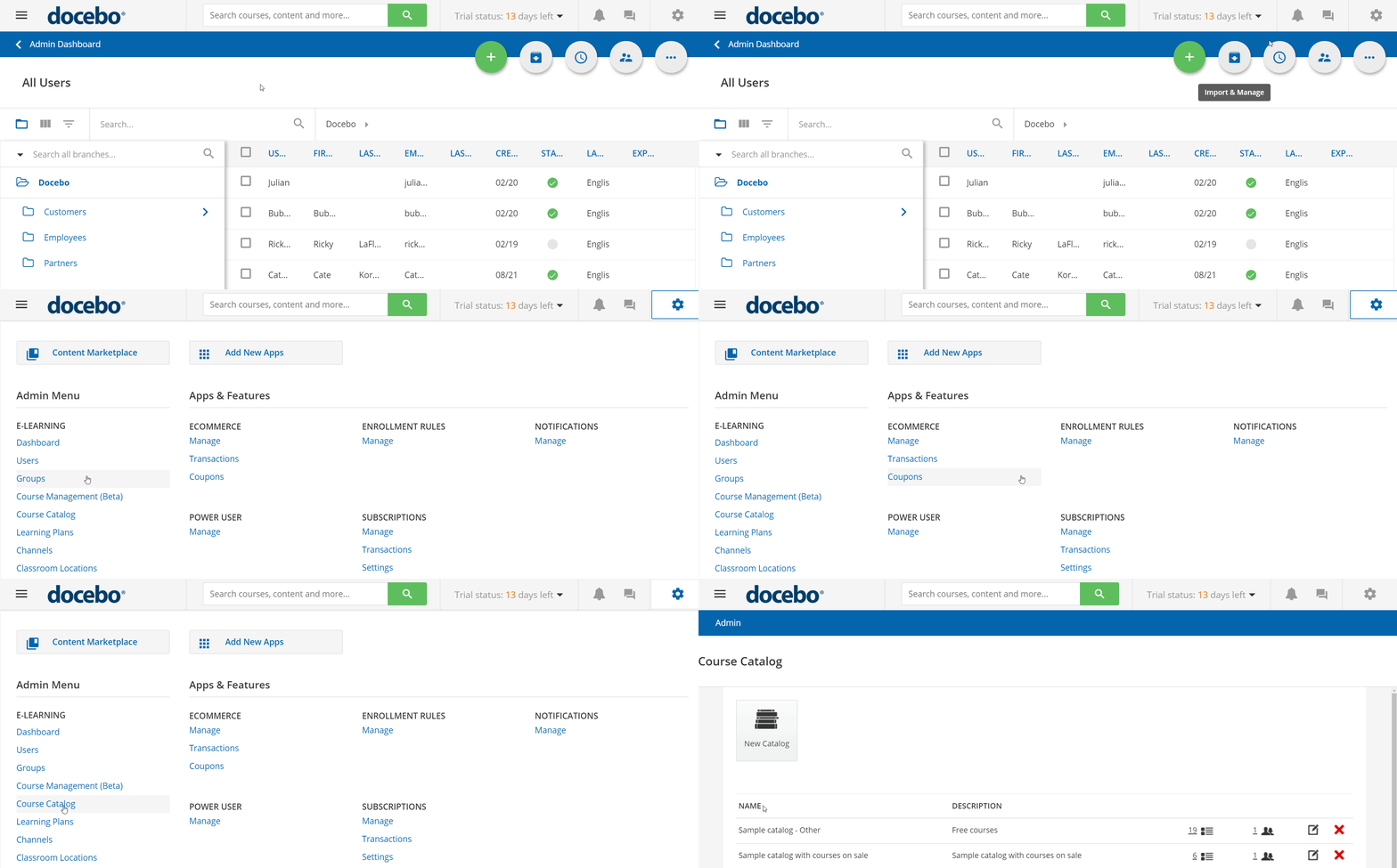
Overall, I’d say, that getting started with Docebo can get pretty tedious owing to its failure to provide an onboarding experience and thereby leaving you in dark regarding all of its bells and whistles.
Managing users & user roles
Adding new users in Docebo, as with most other LMSs, is done either through the UI or by uploading a CSV file for creating users in bulk.
After I added a new user, a pop-up appeared asking if I’d like to enroll them to any courses right away, which I found convenient.

I was on my way to import users via CSV when I landed on this screen:
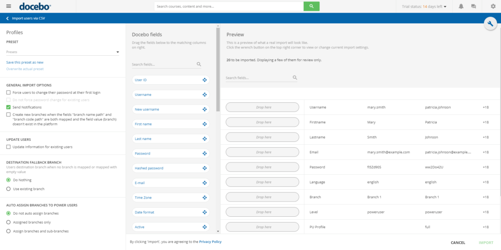
It looked really puzzling and I wasn’t sure which part I should pay attention to in order to advance.
Users can also self-register if the corresponding option is enabled. Self-registration might require admin approval.
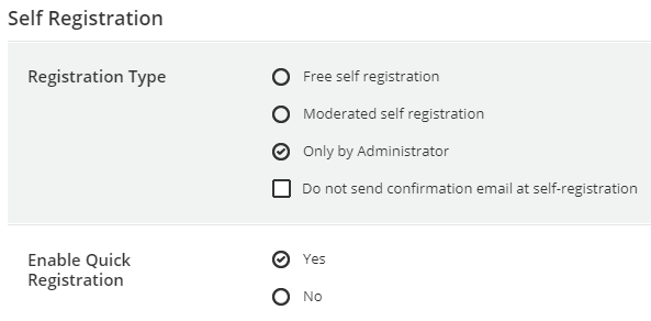
It should be mentioned that it’s often unclear what each option does based on its name. It would be great to see Docebo add pop-up hints for this like the ones that TalentLMS uses.
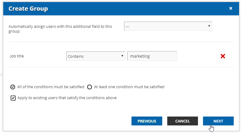
The organization structure in Docebo is built using Branches. You can create an unlimited number of these with unlimited nesting levels. In addition, you can create Groups that can include users from different Branches. Also, for Groups, you can set automatic rules based on which new learners added to the platform will be automatically moved to one group or another.
In terms of user roles, Docebo has three “user levels,” as it calls them – User, Poweruser, and Superadmin. When I tried to customize one of these, I spent 15 minutes browsing the Knowledge Base before realizing that “user levels” are not actually the user roles I wanted to change. Instead, the roles are called “User Profiles” and the functionality that lets you edit these is buried in a menu called Profile Management.

Now, these are named Instructor, Manager and Author and they can be customized, which was exactly what I was looking for.
I found the user management capabilities in Docebo to be sufficient but not very convenient because some functionality is hidden in unexpected places.
Adding and managing content
Loading content into Docebo begins when you create a course. Then you’re able to choose what type of content you want to upload from the Training Material tab. I found it a bit inconvenient that you have to choose what sort of file you want to upload first and can’t just select a few from your computer, letting the system decide what file types they are.
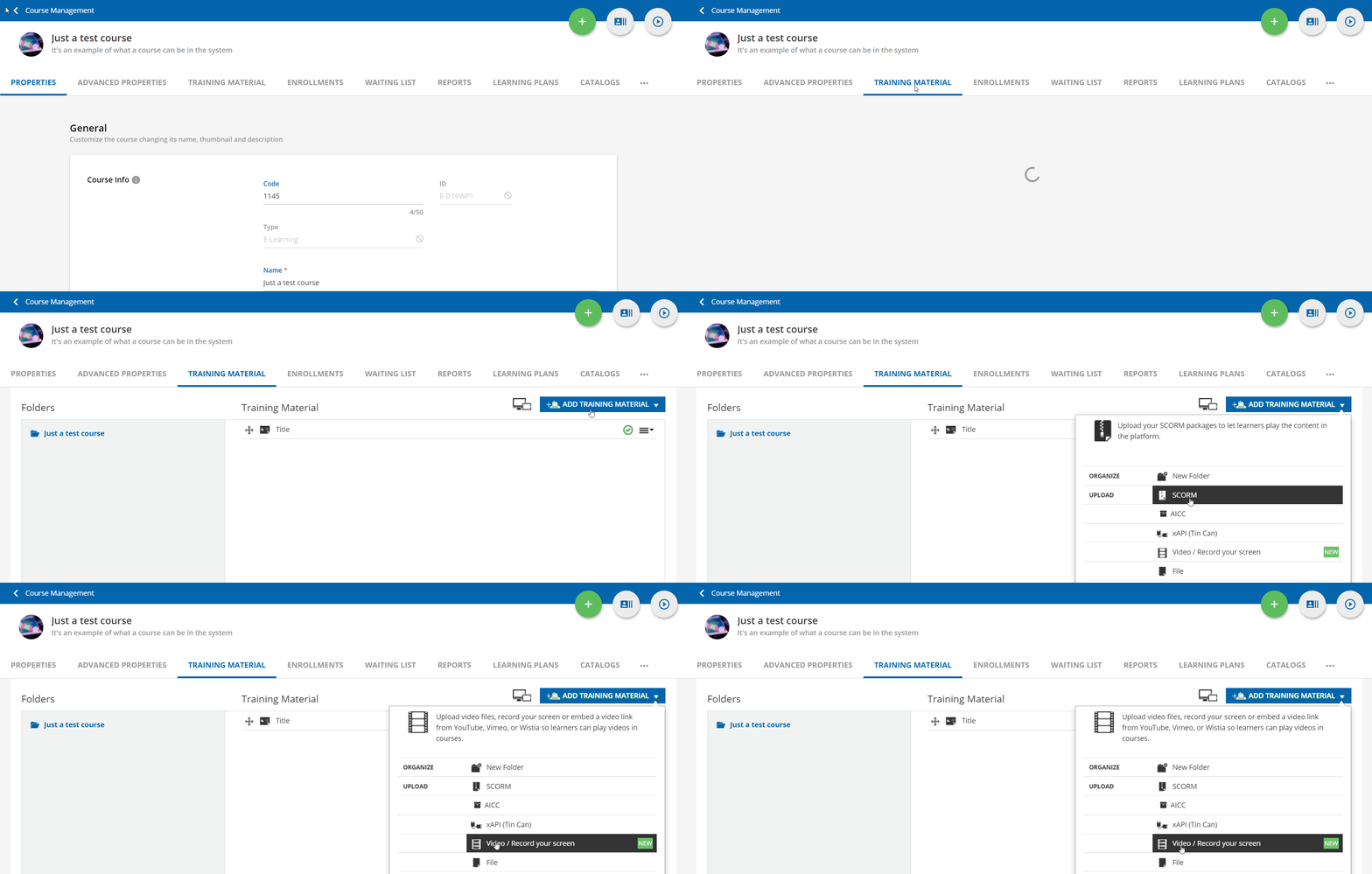
In addition to uploading a bunch of video formats, SCORM, and xAPI packages, Docebo lets you create HTML pages consisting of plain text and media where you can also embed web objects. Any content you upload is analyzed by Docebo’s AI to tag it with keywords to make it easier for learners to find what they’re looking for. Not really useful if you’re just starting to build up your course library, but it may be helpful for surfing the Marketplace.
Marketplace is a section of the platform where learners can buy courses on different topics made by third-party instructional designers. I didn’t have time to assess the quality of the content for this review, but I presume that it’s good. There’s a feature called Areas of Interest that’s linked to the Marketplace – it lets learners pick what topics they want to study and then offers third-party courses from the marketplace based on their selections.
The built-in quiz editor has 8 question types and does the job, but the interface can be hard to wrap one’s head around sometimes.
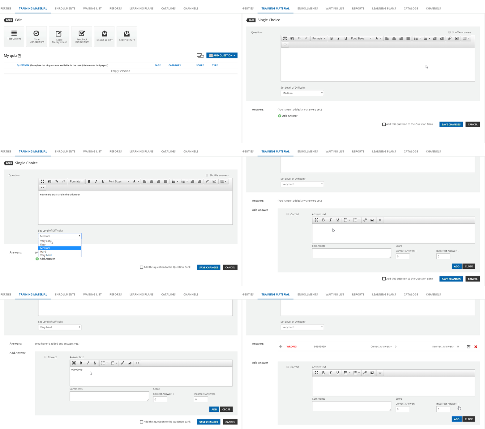
You can also add questions to a Global Question Bank and pull them from there when needed in future courses.
When I finished creating my quiz, it was easy to assign the course to a user and specify the day of enrollment. I could also use the Enrollment Rules tool to enable automatic enrollment in the course when a new user is added to a specified group or branch.
Courses can then be combined into Learning Plans. They can have their own settings and due dates and can be assigned to users on an individual basis.
To sum up this section, I’ll say that Docebo has all the functionality you might need for content management but again, one complaint I have is on a questionable UI/UX.
Reporting
There are 9 canned reports and the option of creating custom reports. From what I could see, Reports in Docebo looks fine – it offers a bit of graphics, a few different types of reports based on what you select, a course or a user (group/branch). You can view test responses if you click on the quiz in a course report:
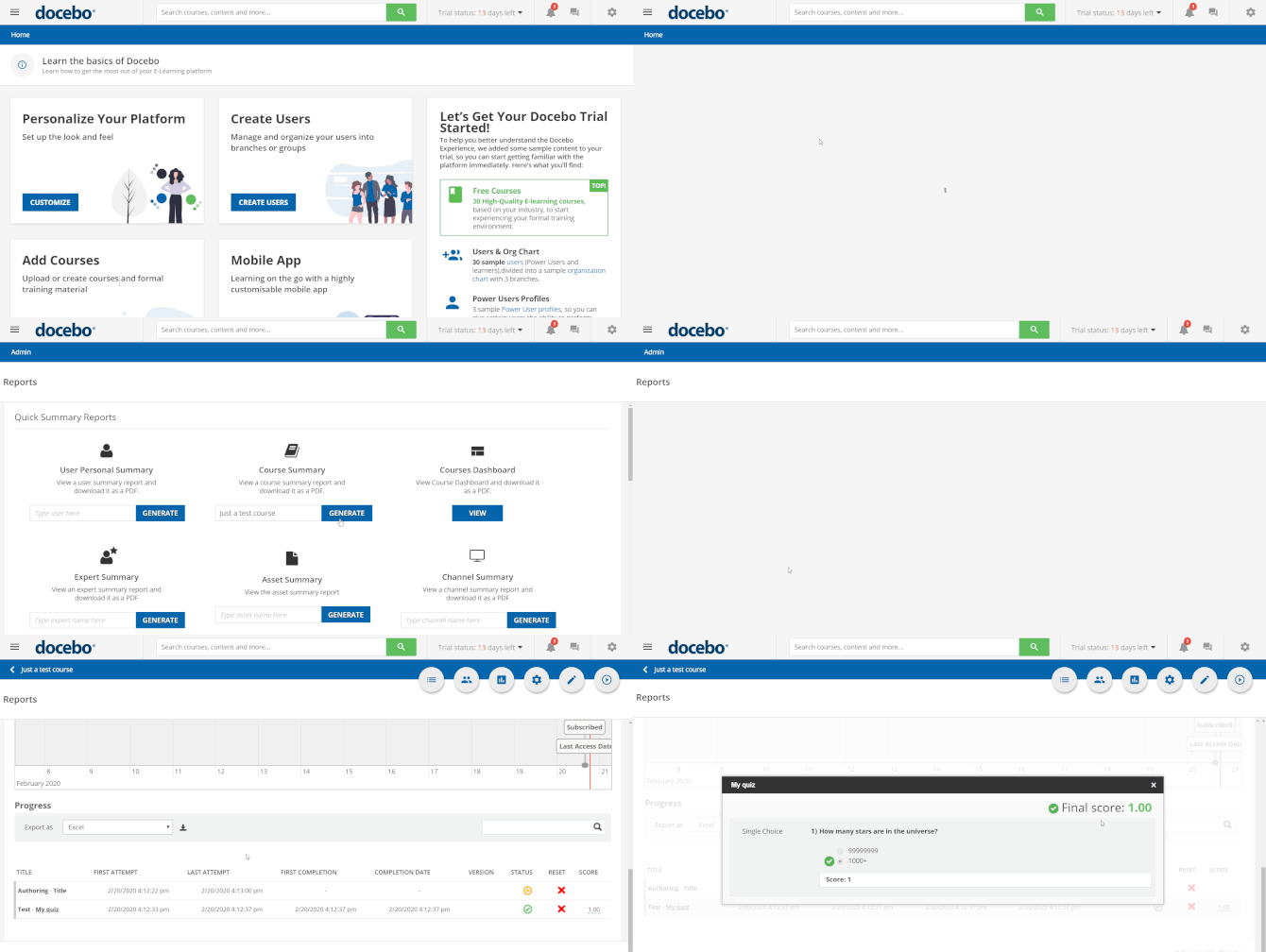
You can generate detailed reports for SCORM and xAPI, and analyze information from the API logs.
Branding, integrations, and security
Docebo’s customization features and “white labeling” in particular, is where the LMS shines – you can customize the header/footer of your learning portal and hide the built-in marketplace.
You can also customize the learner portal by choosing what menus will actually be displayed on monitors and smartphone screens. For example, if you don’t want the “My Areas of Interest” option to show up in the mobile app, you can turn it off via this white labeling feature.It’s possible to change the background image and all the colors on the sign-in page, even in the mobile app. You can use custom CSS if you prefer.
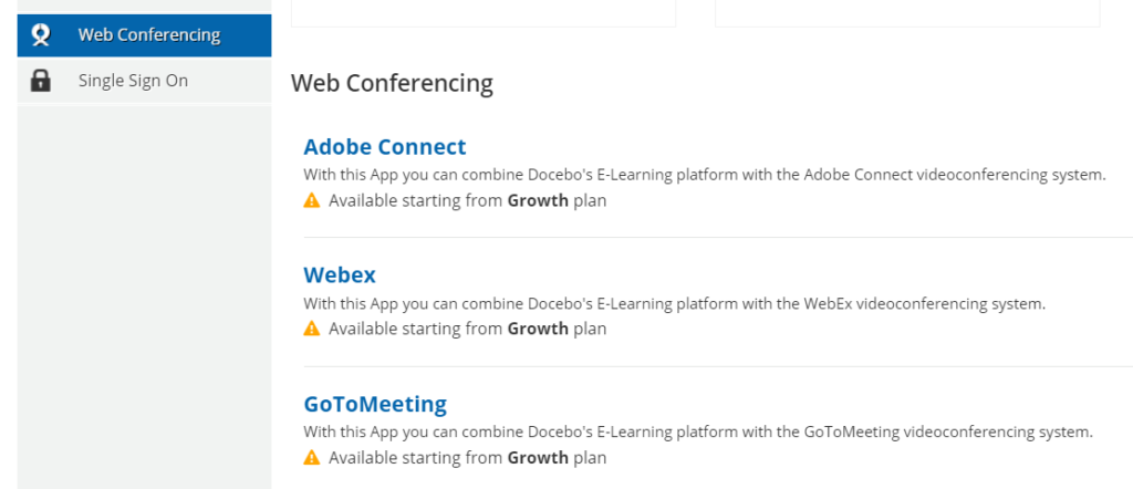
The list of possible third-party integrations includes WordPress, Vivocha, Google Analytics, Optimizely, Zendesk, Shopify, Slack, and Google Drive. There’s also a bunch of webinar apps it can be integrated with for ILT like BlueJeans, AdobeConnect, Webex, GoToMeeting, and Zoom.us.
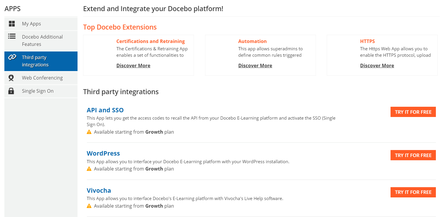
Of course, you can set up single sign-on here – you just need to choose one of the providers that include SAML, LDAP, Auth0, or OpenID. Most of these integrations are provided for an additional fee.
I was impressed when I learned that Docebo lets you build your own branded app for an additional fee – all you need to do is select which menus you need in the app and load your own custom graphics and texts. Then you get to download a package that you then are supposed to submit to Google Play or/and AppStore, and voila, you have your own learning app!
Overall, customization is one area where Docebo truly lives up to its promise of being a great LMS experience. Too bad that you need to pay separately for most of the integrations.
Learning experience and mobile device support
The learner portal in Docebo looks OK by default, but there are some menus that I would disable from the start.
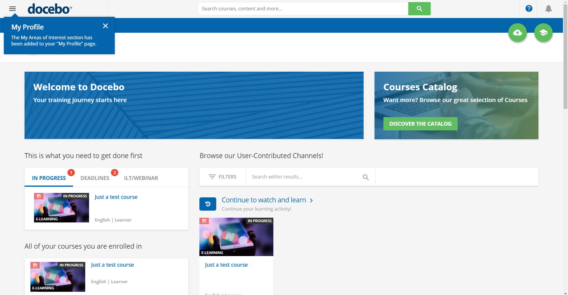
The mobile app, on the other hand, was really minimalistic, only showing Areas of Interest and Offline Content but not showing the courses that my learner account was enrolled in. Since my Areas of Interest weren’t configured on the desktop, I didn’t see anything – the app was literally empty while, in fact, a course had been assigned to me:
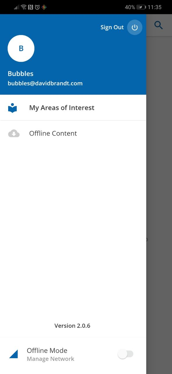
Of course, you can customize this in the admin mode, but all these operations take time. So, why not do it right by default so that users won’t have to spend their time tweaking the system to make it work?
Docebo calls their product a modular system, so one of the modules they offer as an addition to the main functionality is called Coach & Share. Basically, this allows you to select experts on different topics like Marketing, Soft Skills, and such, more of which you can create manually. Learners can reach out to experts and bug them with questions. Also, thanks to this feature, learners can upload files and contact each other in open discussions that you or experts can monitor.
There are your ubiquitous ILTs and webinars for which there’s a bunch of integrations to choose from.
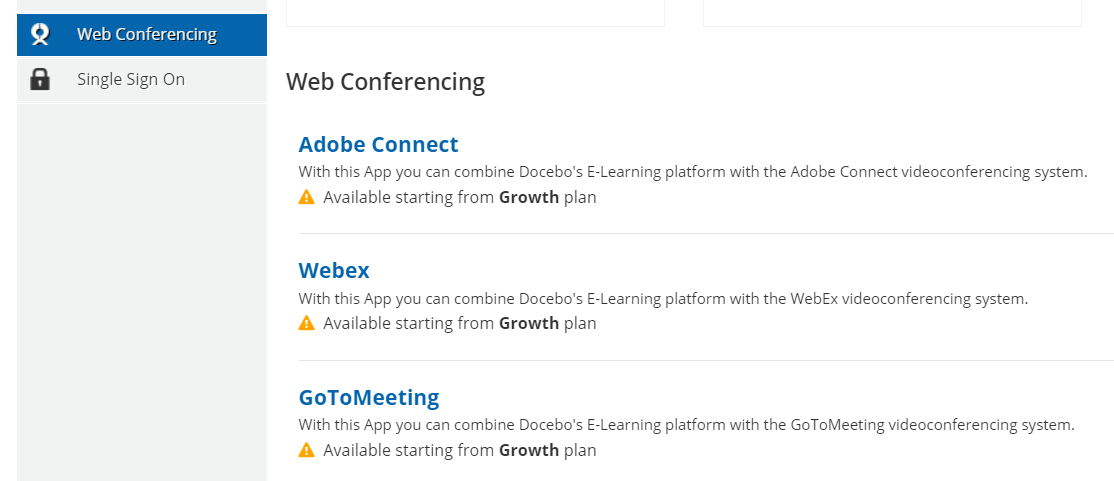
The learning experience in Docebo can be described as being a little quirky with some buttons not working the way you’d expect them to, but I guess you can overcome this with customization if you really want to.
Docebo LMS Pros and Cons
Pros
- Lots of integrations with webinar services and SSO providers
- Allows scheduled reports and custom reports (additional fee)
- Includes e-commerce
- Built-in course marketplace where learners can buy courses built by professionals
- Great customization functionality – you can even create your own branded mobile app for an additional fee
Cons
- Hard to get started as there is zero onboarding and its interface is cumbersome and unintuitive
- Requires more than average customization and fiddling with to provide a good learning experience for users
- Interface often feels unintuitive
- Some customers complained about the quality of support for entry-level pricing plans and huge delays in response times
- Various additional modules like “Coach & Share” are only available in higher pricing tiers
- Claims about the platform being powered by AI turn out to be nothing more than a marketing ploy
Docebo LMS Business Use Cases
Ideal for:
- Continuous employee training: if you spend a sufficient amount of time learning how to use this product, you’ll get a powerful LMS for training your employees.
- Employee onboarding: thanks to smart enrollment rules and tools for building your organization’s structure using groups and branches, it’s relatively easy to get onboarding up and running. Automatically generated certificates will help you with that.
Suitable for:
- E-commerce: this LMS has all the required integrations that one would need to start selling their courses online. A marketplace of ready-to-use content will also help attract customers.
- Academic: there are custom user roles, sufficient reporting, LTI, PENS and localization features, so this platform might be a good fit for academic institutions.
Won’t work for:
- Short-term training projects: I can’t recommend this product for short-term projects because of its complexity.
Docebo LMS Pricing
There are two main pricing plans: Growth and Enterprise. Their features differ such that one has certain integrations that the other doesn’t. For example, the Enterprise plan has regional cloud servers in the US, Canada, Germany, Ireland, and Australia – something that the Growth plan does not. A few modules (e.g., Coach & Share and Integrations) are available for a fee, so you can get just the options you really need.
Prices are not listed on their pricing page, so your best bet would be to request a custom quote for your organization on this page.
To sum up, Docebo is a decent LMS with lots of functionality that can be useful to organizations of different sizes and can handle a number of tasks. The UI is overly complicated at times, which almost made me quit writing this review a few times.
It’s certainly not a product you can pick up and get up to speed within an hour – tweaking it to an acceptable state will require that you study Docebo’s Knowledge Base for hours. Also, the vendor’s claim about their product being AI-powered seems to be anything but true.

